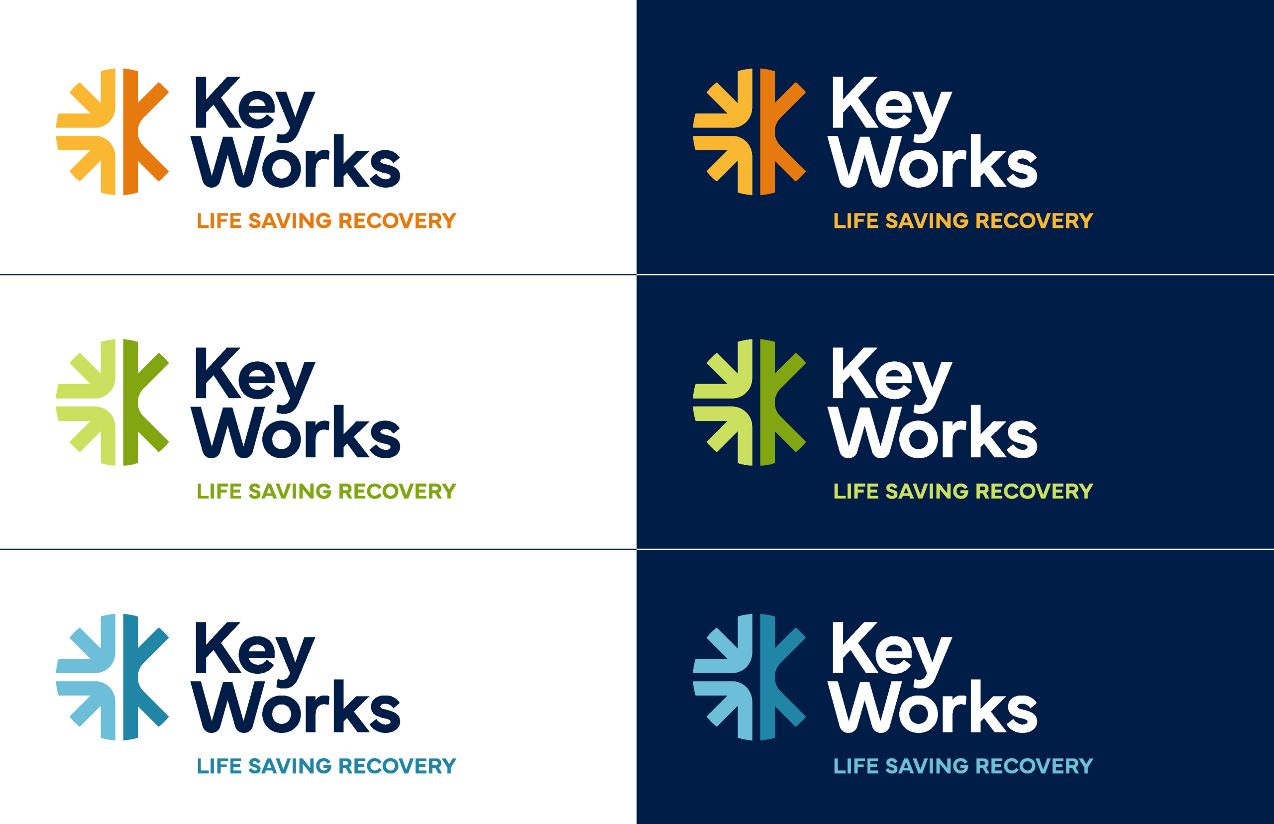
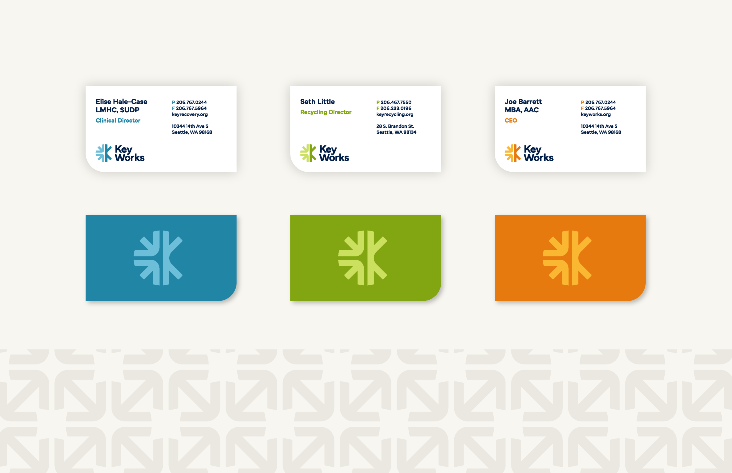
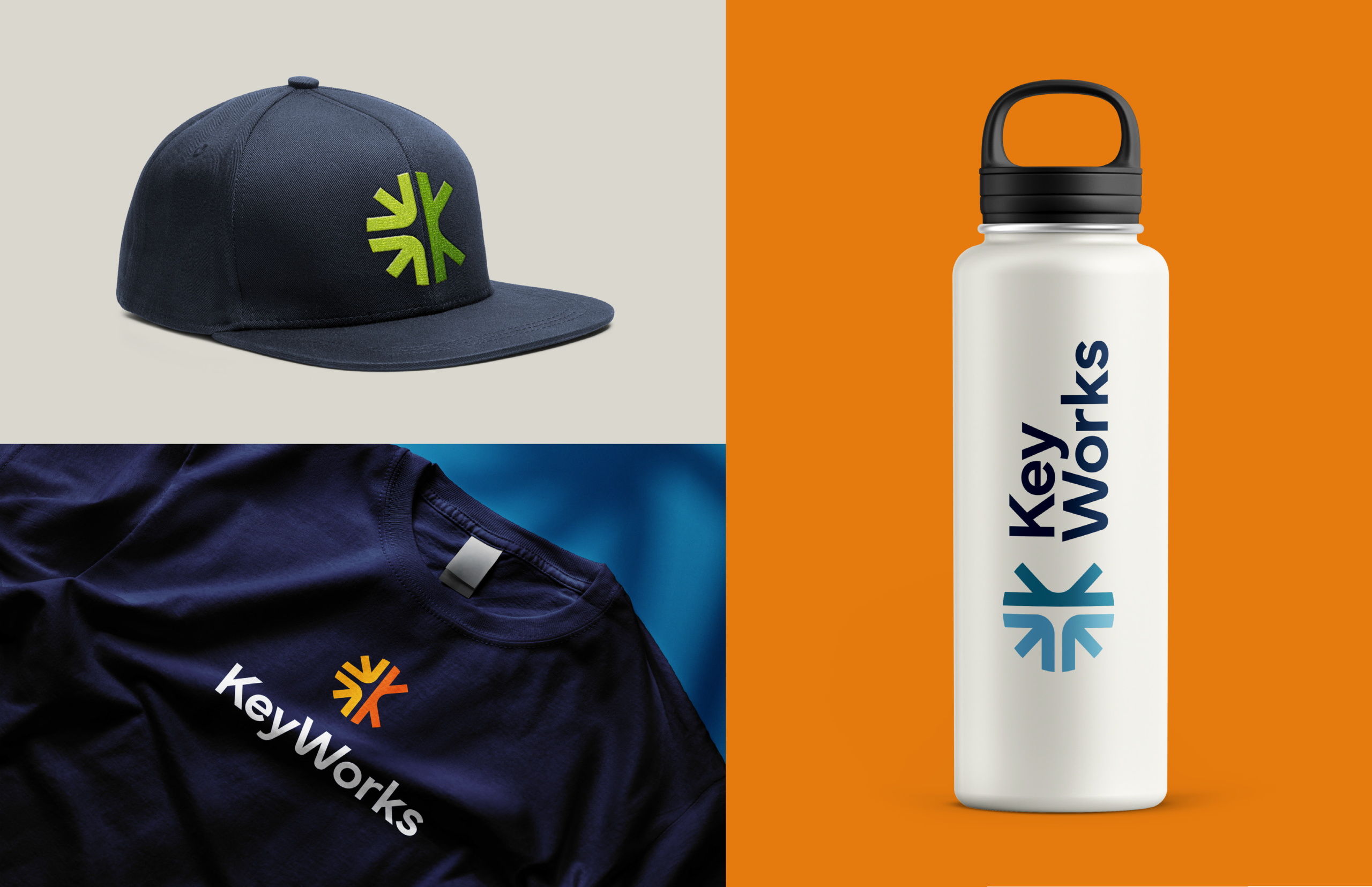
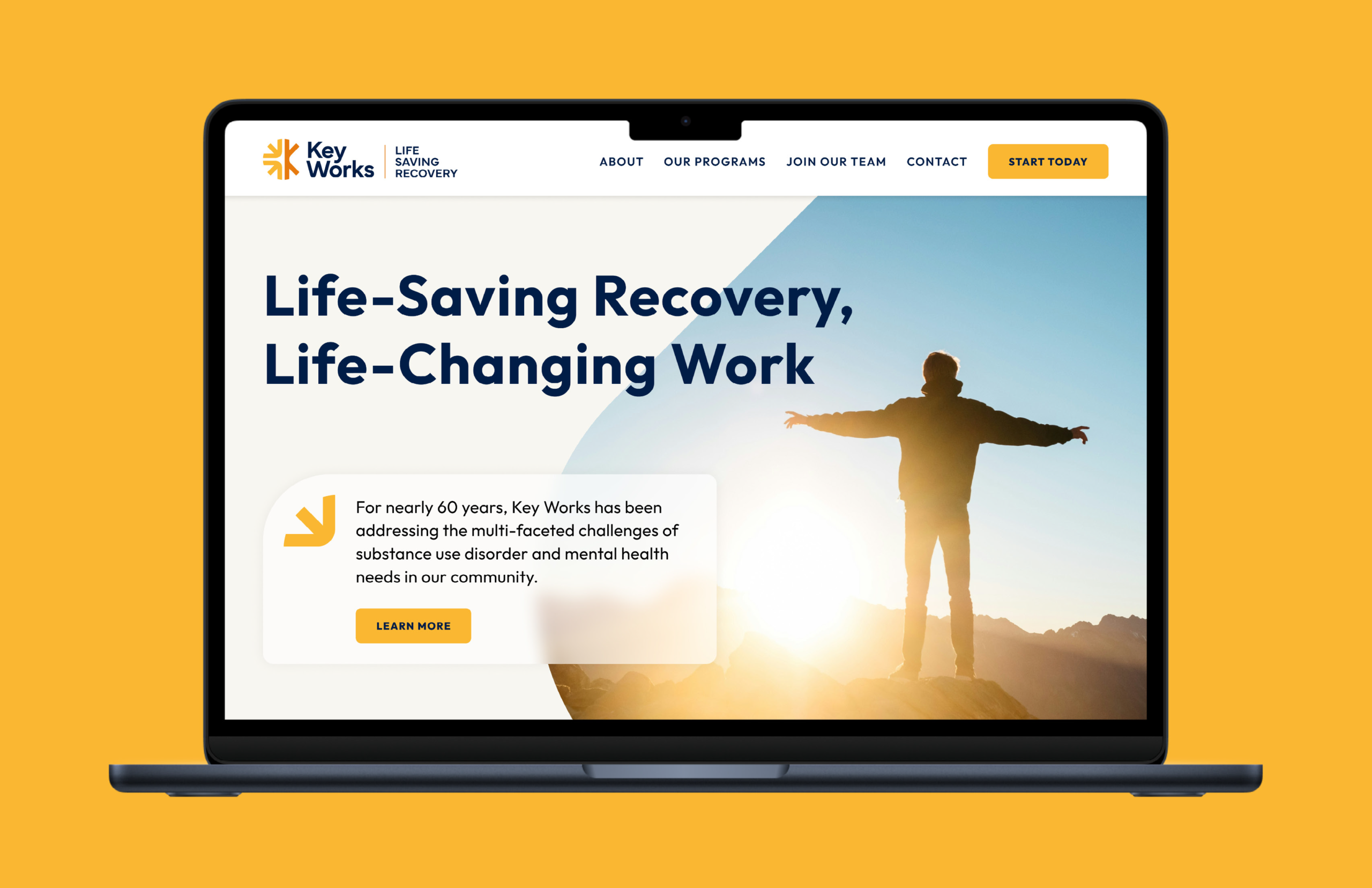
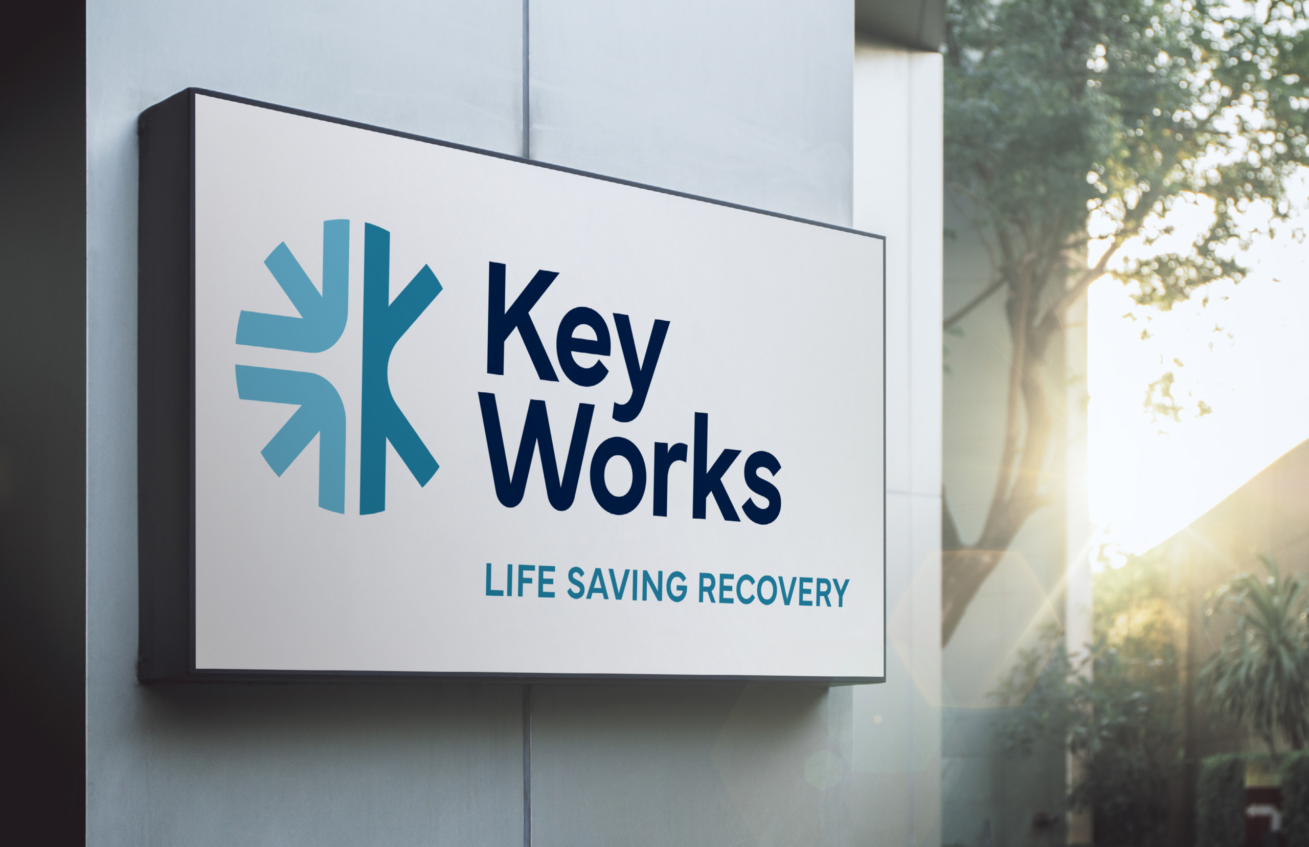
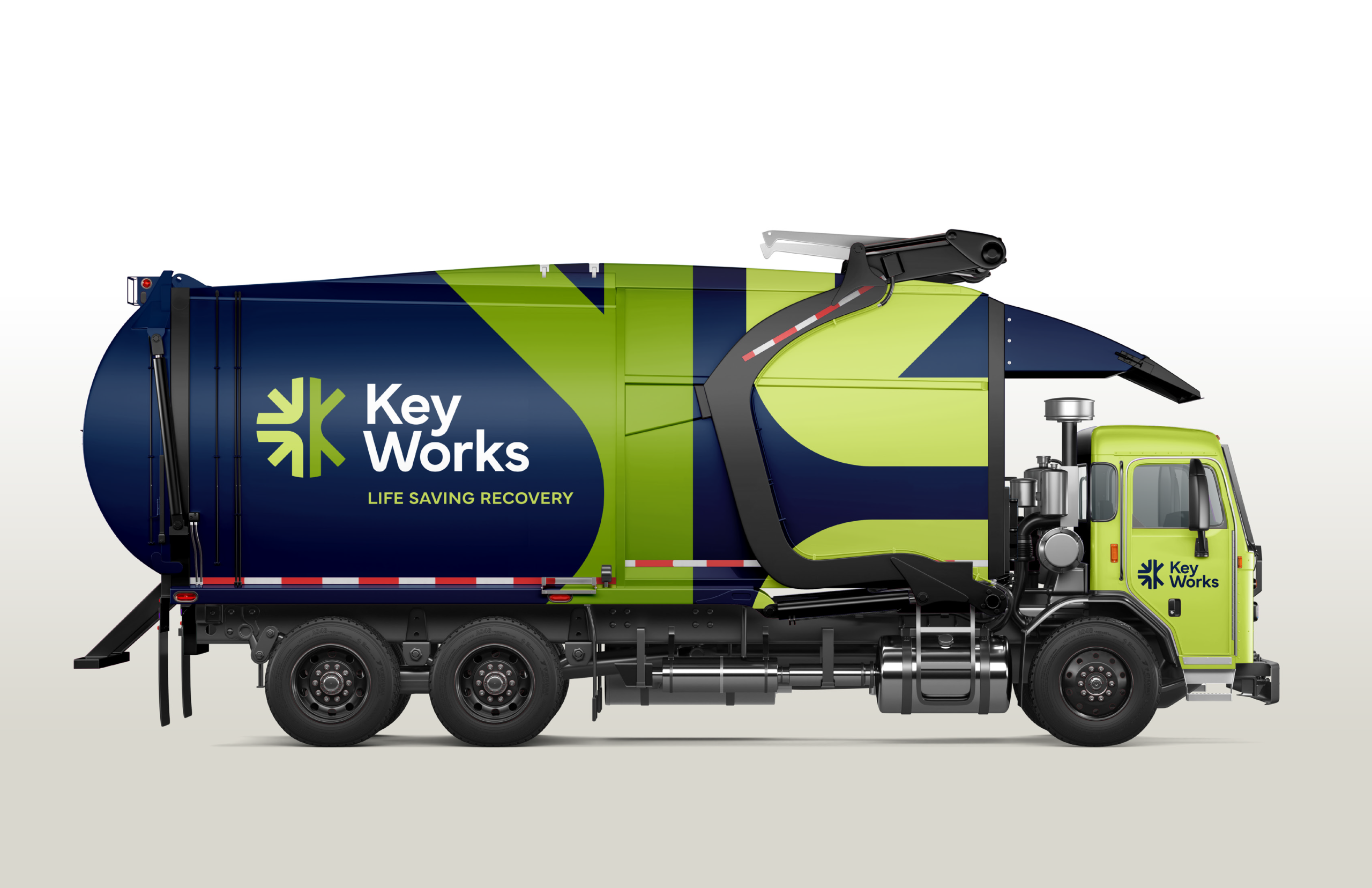
Key Works came to us at a pivotal moment for their organization. Their community-focused work spans advocacy, recovery services, and job training at a zero-to-landfill recycling enterprise—three distinct operations that only reach their full impact when people understand how connected they really are. The old brand wasn’t doing that story justice. We set out to build a single identity that could pull everything together and make their model instantly clear. The new name, Key Works, speaks to unlocking human and community potential. The brand system uses distinct colors to differentiate each part of the organization, and brings warmth, clarity, and purpose to every touchpoint. Today, the organization can explain its mission in one cohesive voice—one that reflects both the depth of their history and the hope they create every day.